


A financial dashboard is a single, live visual interface that pulls your most critical money metrics into one place and updates automatically, often in real time. Think of it as your business’s financial control panel: instead of digging through spreadsheets or waiting for a monthly report, you see a cash runway count of several months or an aged accounts receivable balance for overdue invoices the moment you log in. CFOs, small-business owners, and freelancers all use them, and the best ones refresh without any manual effort on your part.
Financial dashboards consolidate key financial metrics — revenue, expenses, cash flow, profitability, and forecasts — into a centralized visual interface built for continuous monitoring and proactive management. That distinction from a static report is the whole point.
Key Takeaways
A financial dashboard is only as reliable as the reconciled books underneath it — build the source of truth first, then the visual layer.
| Point | Details |
|---|---|
| Define decisions first | Write down 3–5 questions your dashboard must answer before choosing a single metric or tool. |
| Source of truth is foundational | Connect bank feeds, reconcile to your GL, and assign one owner for data accuracy before building any chart. |
| Match tool to scale | Use Google Sheets or Excel for simple setups; move to Qlik, ThoughtSpot, or FineReport when you need multiple connectors or multi-entity rollups. |
| Validate before trusting | Trace every dashboard number back to a bank statement or posted journal entry before using it for decisions. |
| Kelliworks supports the full setup | Kelliworks provides bookkeeping, reconciliation, and custom financial reporting to build the foundation a reliable dashboard requires. |
Table of Contents
- What is a financial dashboard, and how does it differ from a report?
- Why a financial dashboard makes your decisions faster and clearer
- Which metrics and KPIs should your dashboard include?
- Common dashboard types and what each one includes
- How to build an effective financial dashboard, step by step
- Which tools and templates should you use?
- How to protect your dashboard’s data integrity
- Design principles that make your dashboard readable at a glance
- How to use your dashboard in daily and weekly decisions
- Why dashboards matter most for small businesses
- Kelliworks can help you move from spreadsheets to a live dashboard
- Sources
What is a financial dashboard, and how does it differ from a report?
Most people treat dashboards and financial reports as interchangeable. They are not, and confusing them leads to slow decisions and missed signals.
Financial dashboards are dynamic instruments that update automatically, often in real time or near real time, unlike static financial reports produced on a fixed schedule for compliance and historical review. Here is the practical difference:
- Purpose: Dashboards manage the present and near future. Reports document the past.
- Cadence: Dashboards refresh daily, hourly, or continuously. Reports are produced monthly, quarterly, or annually.
- Interactivity: Dashboards let you filter, drill down, and slice by date or segment. Reports are fixed documents.
- Audience: Dashboards serve operators making live decisions. Reports serve auditors, lenders, and regulators.
- Traceability: Reports carry full audit trails and footnotes. Dashboards surface signals, not source documentation.
Use a dashboard when you need to act — pause spending, call a customer, adjust a forecast. Use a report when you need to prove — file taxes, present to investors, satisfy a lender. Both matter; neither replaces the other.
Why a financial dashboard makes your decisions faster and clearer
The core benefit of a financial performance dashboard is speed. When your cash position, revenue trend, and margin are visible at a glance, you spend less time assembling data and more time acting on it.
A properly designed dashboard reduces cognitive load by answering strategic questions at a glance — whether your cash runway is healthy, whether a growth initiative is profitable — so you can act without digging through transactional ledgers. Three practical examples show how that plays out:
Monitoring: Your dashboard shows cash runway dropping noticeably over several weeks. You see it before payroll becomes a problem, not after.
Early-warning signals: Gross margin falls below plan. Without a dashboard, that shows up in a monthly report three weeks later. With one, you see it this week and can trace it to a specific product line.
Fewer manual reconciliations: When your dashboard pulls directly from your accounting system, you stop copying numbers from QuickBooks into a spreadsheet every Monday morning. That alone recovers hours each week for many small-business owners.
One important caveat: these benefits depend entirely on data integrity and thoughtful design. A dashboard built on unreconciled books or cluttered with 40 metrics delivers none of them. We cover both topics in detail below.
Which metrics and KPIs should your dashboard include?
The right KPI set depends on your role, but most financial dashboards share a core group of metrics. Effective dashboards focus on decision-making metrics — daily cash burn, budget-to-actual variance, rolling revenue forecasts, and AR aging — and surface them early so you can intervene before issues escalate.
Here are the essential KPIs, with a rationale for each:
- Cash position: Your bank balance right now. The most immediate signal of financial health.
- Cash runway / burn rate: At the current spend rate, how many months until cash runs out. Critical for any business not yet cash-flow positive.
- Revenue (actual vs. plan): Are you hitting your targets? The gap tells you whether to accelerate or pull back.
- Gross margin: Revenue minus cost of goods sold, as a percentage. Tracks pricing power and production efficiency.
- EBITDA or operating profit: Shows whether the core business generates cash before financing decisions.
- Accounts receivable aging: How much is owed to you and for how long. Overdue buckets (30, 60, 90+ days) signal collection risk.
- Days payable outstanding (DPO): How long you take to pay suppliers. Useful for managing working capital.
- Budget vs. actual variance: The gap between what you planned to spend and what you actually spent, by category.
- Rolling forecast: A forward-looking revenue or cash projection updated with actuals each period.
- Current ratio and quick ratio: Short-term liquidity indicators that lenders and investors watch closely.
Pairing these KPIs with business financial goals gives each metric a target to measure against, which is what turns a number into a decision signal.
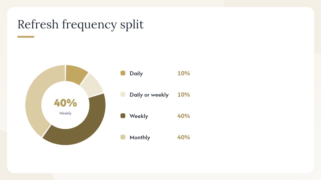
Suggested refresh frequency
| KPI | Refresh Frequency | View Level |
|---|---|---|
| Cash position | Daily | Executive and operational |
| Cash runway / burn rate | Daily or weekly | Executive |
| Revenue vs. plan | Weekly | Executive and FP&A |
| Gross margin | Weekly | FP&A and operational |
| AR aging | Weekly | Operational |
| DPO | Weekly | Operational |
| Budget vs. actual variance | Monthly | Executive and FP&A |
| Rolling forecast | Monthly | Executive |
| Current ratio / quick ratio | Monthly | Executive |
| EBITDA / operating profit | Monthly | Executive |
Executive views need the top five or six signals. Operational views can carry more granularity, but keep each view purpose-built for its audience.
Common dashboard types and what each one includes
Choosing the right dashboard type is as important as choosing the right metrics. Here are the six most common types, with a mini-template for each.
-
CFO / executive overview dashboard: KPI cards for cash position, revenue vs. plan, gross margin, and EBITDA. A 12-month revenue trend line, a budget variance bar chart, and a rolling forecast. Designed for a 60-second morning review. Best for: CEOs, CFOs, and board presentations.
-
Cash flow and runway dashboard: Daily cash balance chart, weekly burn rate trend, and a runway countdown (months remaining). Includes a cash-in vs. cash-out waterfall for the current month. Best for: founders, startups, and any business managing tight liquidity.
-
FP&A performance / KPI dashboard: Actual vs. budget variance by department, gross margin by product line, and a rolling 13-week revenue forecast. Includes drill-down filters by region or business unit. Best for: finance teams running monthly planning cycles.
-
AR/AP aging and working capital dashboard: Aging buckets (current, 30, 60, 90+ days) for both receivables and payables, days sales outstanding (DSO), DPO, and a working capital trend. Best for: operations managers and bookkeepers tracking collections and vendor payments.
-
Sales-finance dashboard: Bookings vs. revenue, pipeline coverage ratio, average deal size, and customer acquisition cost vs. lifetime value. Bridges the gap between sales activity and financial outcomes. Best for: revenue-focused leadership teams.
-
Personal finance / net-worth dashboard: Net worth trend, income vs. expenses by category, savings rate, and investment account balances. Nonprofit and sector-specific versions of this type can structure metrics to tell a story, linking program-level KPIs to financial health so stakeholders see both impact and sustainability. Best for: individuals, freelancers, and nonprofit finance leads.
Downloadable templates for most of these types are available through tool vendors and template galleries listed in the sources section below.
How to build an effective financial dashboard, step by step
Building a reliable dashboard takes about a week of focused setup if your books are clean. If they are not, reconciliation comes first. Here is the ordered checklist:
-
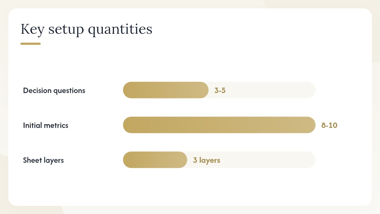
Define the decisions you need to make. Write down three to five questions your dashboard must answer (e.g., “Do I have enough cash to hire next month?”). Every KPI you add should answer one of those questions directly.
-
Choose your KPIs. Use the list above as a starting point. Limit your first dashboard to eight to ten metrics. You can always add more later.
-
Pick your tool. Spreadsheets (Google Sheets or Microsoft Excel) work well for small businesses with one or two data sources. BI tools (Qlik, ThoughtSpot, FineReport) make sense when you have multiple entities, many connectors, or need multi-user access with role-based permissions.
-
Map your data sources. List every system that holds financial data: your accounting software (QuickBooks, Xero), bank accounts, payroll platform, and CRM. Identify which system is authoritative for each metric.
-
Establish a single source of truth. Your general ledger (GL) is the source of truth for all accounting-based metrics. Establishing a single source of truth and automating reconciliation are foundational to a reliable dashboard; without them, dashboards show conflicting or stale numbers.
-
Design your layout. Put the most critical KPI cards at the top left (where eyes land first). Group related metrics. Use consistent color rules: green for on or above target, red for below.
-
Automate the refresh. Connect live data feeds where possible. Some platforms compute dashboard blocks live from reconciled books using bank connectors, so every number ties to a posted journal entry and the underlying transaction.
-
Validate against your bank and GL. Before trusting any number, trace it back. Does your dashboard’s cash balance match your bank statement? Does revenue match your GL? Fix discrepancies before sharing the dashboard with anyone.
-
Iterate. After two weeks of use, remove any metric nobody looks at and add any question that keeps coming up unanswered.
Pro Tip: For Excel or Google Sheets builds, use a three-layer architecture: a hidden “Transactions” sheet for raw data, a “Calculations” sheet for formulas, and a “Dashboard” sheet with pivot tables and slicers. This separation keeps the dashboard refresh-safe and auditable — you can update the raw data without breaking any chart or formula on the presentation layer.
If connector setup or GL reconciliation is beyond your comfort level, that is a clear signal to bring in a bookkeeping or accounting partner before you build. A dashboard built on unreconciled books will mislead you, not help you.
Which tools and templates should you use?
The right tool depends on your data volume, technical comfort, and budget. Spreadsheets are the right starting point for most small businesses. BI tools earn their complexity when you need scale, many data connectors, or multi-entity rollups.
Using pivot tables, slicers, and a clear backend/frontend separation lets a spreadsheet function like a real dashboard while keeping full transparency and control over your data. For businesses ready to move beyond spreadsheets, automated financial reporting workflows show how dashboards fit into a broader finance operations stack.
Template galleries to explore:
- Google Sheets template gallery (built-in) includes basic budget and cash flow templates you can copy and customize.
- Microsoft Excel’s template library includes financial statement and KPI dashboard starters.
- FineReport’s template center offers pre-built financial dashboard layouts for common use cases.
- Excel visual dashboard patterns show specific chart and control configurations worth replicating.
Use vendor templates to prototype quickly and understand layout conventions. Then replace the sample data with your own source-of-truth connections. A template without clean underlying data is just a pretty shell.
How to protect your dashboard’s data integrity
Data integrity is the single most important factor in dashboard reliability. A dashboard is only as good as its source of truth, and most dashboard failures trace back to unreconciled books, stale connectors, or manual data entry errors, not bad design.
Pro Tip: Establish one reconciled accounting system (QuickBooks, Xero, or equivalent) as the authoritative source for every financial metric before you build a single chart. Everything else connects to it, not around it.
A practical reconciliation checklist:
- Connect bank feeds directly to your accounting software so transactions post automatically rather than being entered manually.
- Reconcile to the GL weekly, not monthly. Catching a mismatch after one week is a 30-minute fix. Catching it after a month is a half-day project.
- Automate transaction matching where your software allows it. Most modern accounting platforms flag unmatched items so nothing slips through.
- Assign clear data ownership. One person is responsible for confirming the books are reconciled before the dashboard is shared each week.
- Trace KPIs back to journal entries periodically. A robust validation routine includes daily bank feed reconciliation, weekly sample-traces from a KPI back to a posted journal entry, and a monthly full GL reconciliation.
Common pitfalls to avoid:
- Treating the dashboard as a report. Dashboards should surface forward-looking signals, not exhaustive historical detail. If you are printing your dashboard and filing it, you are using it wrong.
- Stale connectors. API connections break when vendors update their systems. Set a monthly check to confirm every connector is still pulling live data.
- Double-counting. If revenue flows through both your CRM and your accounting system, pulling from both without deduplication inflates your numbers.
- Poor categorization. Miscategorized expenses corrupt every margin and variance metric downstream. Clean books are the foundation of reliable cash flow management.
Design principles that make your dashboard readable at a glance
The best dashboards answer a small set of critical questions at a glance and surface only the metrics that influence immediate decisions. Decoration and complexity are the enemies of speed.
Do:
- Use minimal KPI cards at the top of the layout — a number, a label, and a trend arrow.
- Apply consistent color rules: green for on or above target, red for below, amber for within a warning threshold. Never use color for decoration.
- Label every chart with units and the time window it covers (“Revenue, USD, trailing 12 months”).
- Use small multiples (a grid of identical small charts) when comparing the same metric across multiple segments or time periods.
- Set threshold lines on trend charts so the target is always visible alongside the actual.
- Choose accessible fonts (minimum 12pt in dashboards viewed on screens) and verify color contrast for colorblind users.
Don’t:
- Use 3D charts. They distort proportions and add no information.
- Build complex legends with six or more series on one chart. Split it into two charts instead.
- Add a metric because it is available. Add it only because it answers a decision question.
- Mix chart types arbitrarily. Bar charts compare categories; line charts show trends over time; use each for its purpose.
Statistic callout: Finance leaders consistently report that the most effective dashboards answer fewer than ten questions — and that adding metrics beyond that threshold reduces, not increases, decision speed. (Source)
For multi-entity or multi-currency businesses, choose tools with native foreign exchange and consolidation features, or apply consistent FX rules in your data pipeline before the dashboard layer. Mixing currencies without a clear conversion rule is one of the fastest ways to produce a number nobody trusts.
How to use your dashboard in daily and weekly decisions
A dashboard is only useful if it drives action. The playbook is simple: check the signal, compare it to your threshold, and take the defined action.
Daily cash check (5 minutes):
- Open the cash position and burn rate cards.
- If cash has dropped more than expected since yesterday, identify the transaction and confirm it was planned.
- If runway has fallen below your alert threshold (commonly 3 months for early-stage businesses), flag it for a same-day conversation with your finance advisor.
Weekly revenue vs. plan review (15 minutes):
- Compare actual revenue to the weekly plan target.
- If the gap is more than 10%, trace it to a specific customer segment or product line using your dashboard’s filter controls.
- Adjust the rolling forecast if the gap reflects a structural shift, not a timing difference.
Monthly budget variance deep dive (30–60 minutes):
- Pull the budget vs. actual variance by category.
- Investigate any line item more than 15% over budget.
- Use the findings to update next month’s plan and leverage financial data for growth decisions.
Decision triggers to define in advance:
- Runway falls below 3 months → pause discretionary hiring and non-essential vendor contracts.
- AR days outstanding exceeds 45 days → launch a collection outreach campaign.
- Gross margin drops more than 3 points below plan → review pricing and cost of goods sold before the next sales cycle.
Different stakeholders interact with the dashboard differently. The business owner reviews the executive summary daily. The bookkeeper owns the reconciliation that keeps the data clean. A finance advisor uses the monthly variance view to guide planning conversations. Each role needs a view calibrated to its decisions, not a single dashboard shared with everyone showing everything.
Why dashboards matter most for small businesses
Small-business owners often tell us they felt like they were flying blind before they had a real-time view of their numbers. That is not an exaggeration. When your cash position lives in a spreadsheet updated once a month, you are always making decisions on stale data.
At Kelliworks, we work with small-business owners, freelancers, and entrepreneurs who are building financial clarity from the ground up. The clients who benefit most from dashboard projects are the ones who already have clean, reconciled books — because a dashboard built on solid bookkeeping gives you genuine confidence in every number you see. The ones who struggle are those who try to build the dashboard first and fix the books later. It rarely works in that order.
Our bookkeeping, reconciliation, and customized financial reporting services are designed specifically to create the source-of-truth foundation that a reliable dashboard requires. When the books are right, building the dashboard is the easy part. When to hire help versus doing it yourself comes down to one question: can you trace every dashboard number back to a reconciled journal entry? If the answer is no, that is where we come in.
Kelliworks can help you move from spreadsheets to a live dashboard
If you want a reconciled, live financial dashboard without the maintenance overhead, Kelliworks offers exactly that kind of support for small businesses and entrepreneurs.

Here is what a typical engagement looks like:
- Source-of-truth setup: We reconcile your books, connect your bank feeds, and establish your accounting system as the single authoritative data source — so every dashboard number ties to a real transaction.
- Connector and reconciliation setup: We configure the data connections between your accounting software, bank accounts, and reporting layer, and build the validation routine that keeps everything accurate week to week.
- Custom dashboard and ongoing maintenance: We build a dashboard tailored to your decisions and maintain it as your business grows, so you are never looking at stale or broken data.
Ready to stop guessing and start seeing your numbers clearly? Explore our virtual accounting department services or learn why small businesses hire a virtual accountant to handle exactly this kind of work.
Sources
These resources offer templates, how-to guides, and conceptual frameworks for building financial dashboards. Template galleries are a fast way to prototype a layout, but they require a clean source-of-truth underneath to produce numbers you can trust.
This article is general information, not a substitute for advice from a qualified financial advisor. Consult a qualified financial professional about your own circumstances before acting on anything here.



One Response